Introducing a Chinese hygiene brand to North America

Roles
Branding, illustration, packaging design, advertising, copywriting
Timeline
May 2024
Overview
Traditional bars and boozy ice cream bars typically have dim lighting, dark color schemes, and a "serious" atmosphere. Ice cream is supposed to be fun, so why are the themes so serious?
Crazy Cow is a concept for a barlour (bar/parlour) that offers cozy ice cream scoops and milkshakes, and desserts that pair well with ice cream. Crazy Cow's brand utilizes fun design and copy to create a light-hearted mood. Down to the names of the flavors of ice cream, Crazy Cow established itself that embraces the fun again.

Jianwei Medical, successful in China, aimed to capture the North American market, but would need new branding
Jianwei Medical creates 100% cotton wipes, and prides itself on the highest standard of hygiene. Seeing the success of their product outside of their key audience, they wanted to branch out when expanding to the North American market. However, they wanted to target a new audience, and with their current branding targeting the maternal and infant audience, they would need updated branding to match their new audience.
Crazy Cow's brand essence is encapsulated through 6 guiding traits
Crazy Cow embodies 6 values - curiosity, socialization, humor, lightheartedness, creativity, and playfulness. These traits form the backbone of the brand, and help inform Crazy Cow's messaging and style.

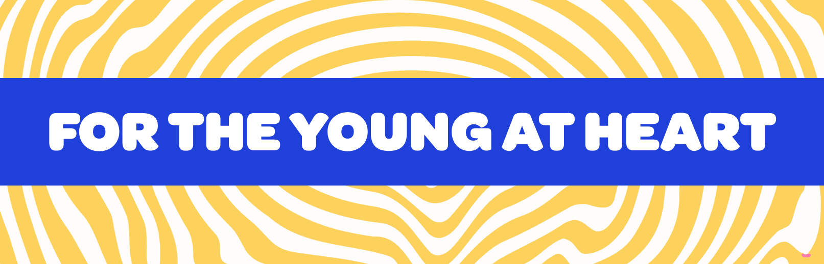
At the heart of Crazy Cow's philosophy is the belief that adults don't stop enjoying play and lighthearted fun when they hit a certain age.
Crazy Cow's brand mission is "For the young at heart". This statement carries throughout the brand as a reminder to people of all ages that they can let their inner-child out, even when enjoying an adult experience.
Tone of voice is playful, casual, and witty to invite everyone to loosen up and indulge a little.
A playful, casual, and witty tone reinforces the brand's identity. From marketing collateral down to the names of the menu items, Crazy Cow's young energy makes sure to let everyone know that when they're eating Crazy Cow, they're going to have to crack a smile.


The cow's contribution to the world of ice-cream is celebrated in the logo, from the curves of the patches to the palette
At the heart of the brand identity is the dairy cow, whose contribution to the world of ice-cream is immeasurable. It inspires everything in the brand identity, from patterns to the color palette.
Hand-drawn lettering harkens back to handmade ice-cream truck lettering. The curves of the logo carry through the identity system, inspiring organic shapes and pattern language. The organic waves of the logo also indicate the energy and liveliness of enjoying ice cream, a night out at the bar, and the "buzz" of alcohol.
By using the pinks and yellows from cow tags and noses, along with injecting color into black spots, the cow's palette was remixed to form the primary brand colors. A perfect match for a twist on a classic ice cream.


A rounded, friendly typeface brings ice cream truck nostalgia into the modern era
When considering typography, I went back to the basics, and found inspiration in ice cream truck typography. Rounded, friendly, and illustrative type was common these trucks, and the Omnes typeface was chosen for its sense of warmth and familiarity.


Vibrant, playful colors meet organic shapes and handdrawn elements - all inspired by cows.
These can be used as backgrounds, photography masks, decorative elements, or content dividers.


The brand extends into the digital space, allowing users to connect or order from Crazy Cow without leaving the house.
