Aimlabs Academy
An engaging and structured learning platform with expert-led masterclass plans that include articles, videos, custom-tasks, and more.
Project duration: Aug-Nov 2023
Roles: Product design, visual design

Objective
One of the core motivations for this project was to address the user's need for clearer direction within our existing product ecosystem. Aimlabs has relied heavily on user-driven exploration, and lacked a systematic way to guide users toward their aim-training goals. This left many users confused about what they should be doing to get better at their objectives.
Drawing inspiration from another one of our products, Proguides, we aimed to infuse our existing product with a similar sense of direction, while introducing another avenue for premium options.
Approach
I stepped into the role of leading the project after the initial development of low-fidelity wireframes by our VP of UX. Using this structure as a guide for the project's required functionality, I set off to create the visual identity of Academy and guide the project to completion, adding in visual flair, custom iconography, and new UI components to our library.


Challenges & constraints
In addition to the short timeline, designing some screens were challenging due to product constraints. One of the biggest challenges was something we had been facing for a while; visual hierarchy.
The "3-column" layout proposed in the wireframes posed a challenge in establishing a clear visual hierarchy. The "extra resources" and "academy leaders" panels, although bulky, were also required and could not be removed or majorly altered.
To prioritize the primary content on the screen, I implemented a thin side-panel to house secondary information, keeping the right two-thirds of the screen for primary content. This would divide the content into 2 groups, as opposed to the previous layout with 3 groups competing for visual attention.
Next, I reduced the amount of individually listed items in the "academy leaders" and "extra resources" sections to an approved point, and opted to make the "extra resources" items smaller versions of the primary cards on the page. This not only helped maintain visual consistency, but also conveyed the concept of shorter plans, as these featured shorter plans with less content compared to primary plans.
Final product overview

Home page. Users can earn "mastery" by completing plans. Extra resources are much shorter in comparison to standard plans, with 1 or 2 steps.

Users can play tasks and see their performance when they're done. The inclusion of mastery thresholds encourages users to keep trying for the next level.

Articles feature a bold graphic at the top to entice users to read. A quick headline lets users know what they can expect.
Once the user clicks on a button from the "trends" or "run it back" sections, they will be able to edit any preferences before jumping into the custom-made task.
Once the user clicks on a button from the "trends" or "run it back" sections, they will be able to edit any preferences before jumping into the custom-made task.
Once the user clicks on a button from the "trends" or "run it back" sections, they will be able to edit any preferences before jumping into the custom-made task.

Our loading screens have been a point of contention for some of our users, as they acted as a functionless barrier between them and practicing.
I overhauled the loading screen to make it a functional part of the experience, adding tips, context, and stats to get the user ready to break their records once in-game and reinforce the core loop of Academy.
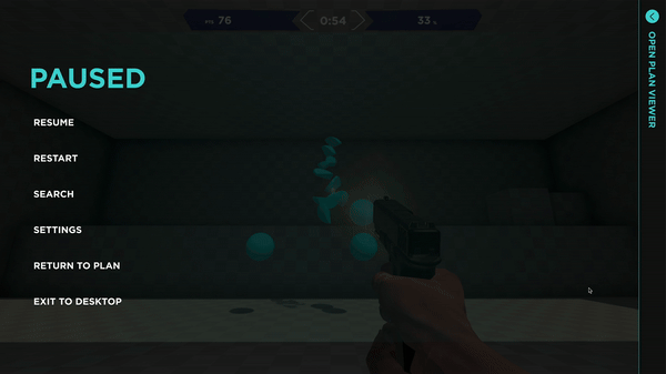
The pause menu was another area that was utilized for functionality. A collapsible side bar allowed the entire plan to be visible when the user paused in the middle of the game, allowing a user to refresh their memory on skills they just learned or adjust their technique on the fly.

Videos were a new feature added to the trainer. Captions and playback features were introduced for Academy's release, so new UI components were needed.

I wanted the user to feel a sense of accomplishment once they completed a plan. Adding a quick "congrats" message, a positive illustration, and a CTA to keep going, aided in retention.